The problem
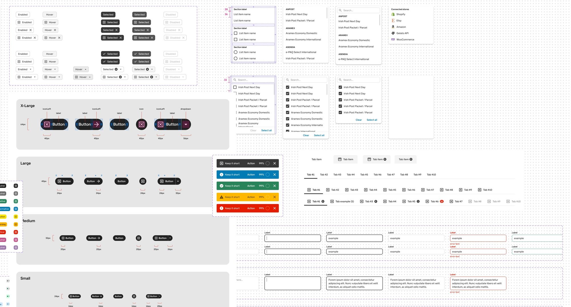
Every designer and developer built their own version of the same button.
There was no shared system. As the team grew, inconsistencies multiplied across B2B, B2C and mobile, and developers kept rebuilding components that already existed. On top of that, a rebrand was under way, so the system had to support an identity that wasn’t final yet.
The approach
Study the systems that already work, then build only what Gelato needs.
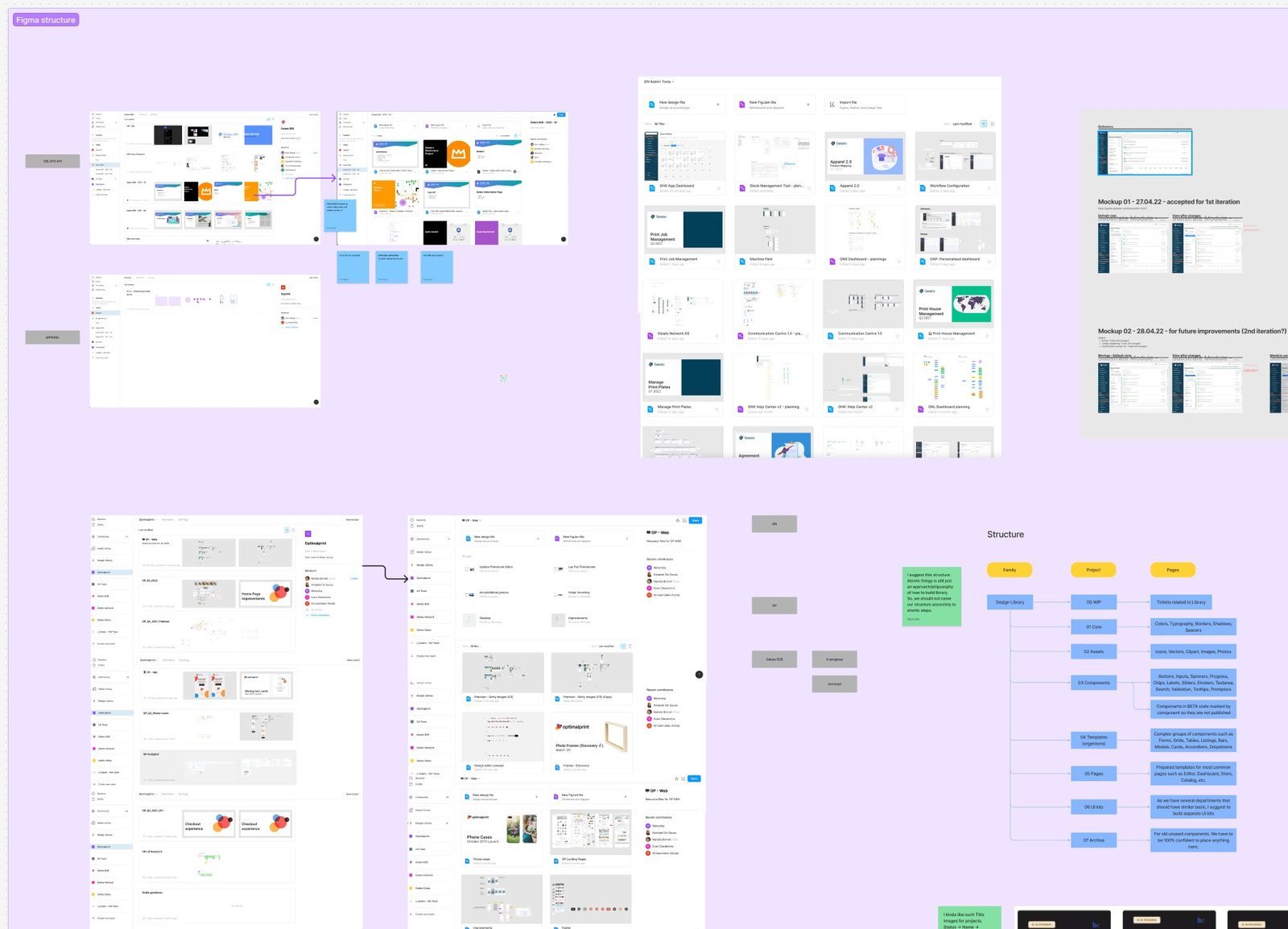
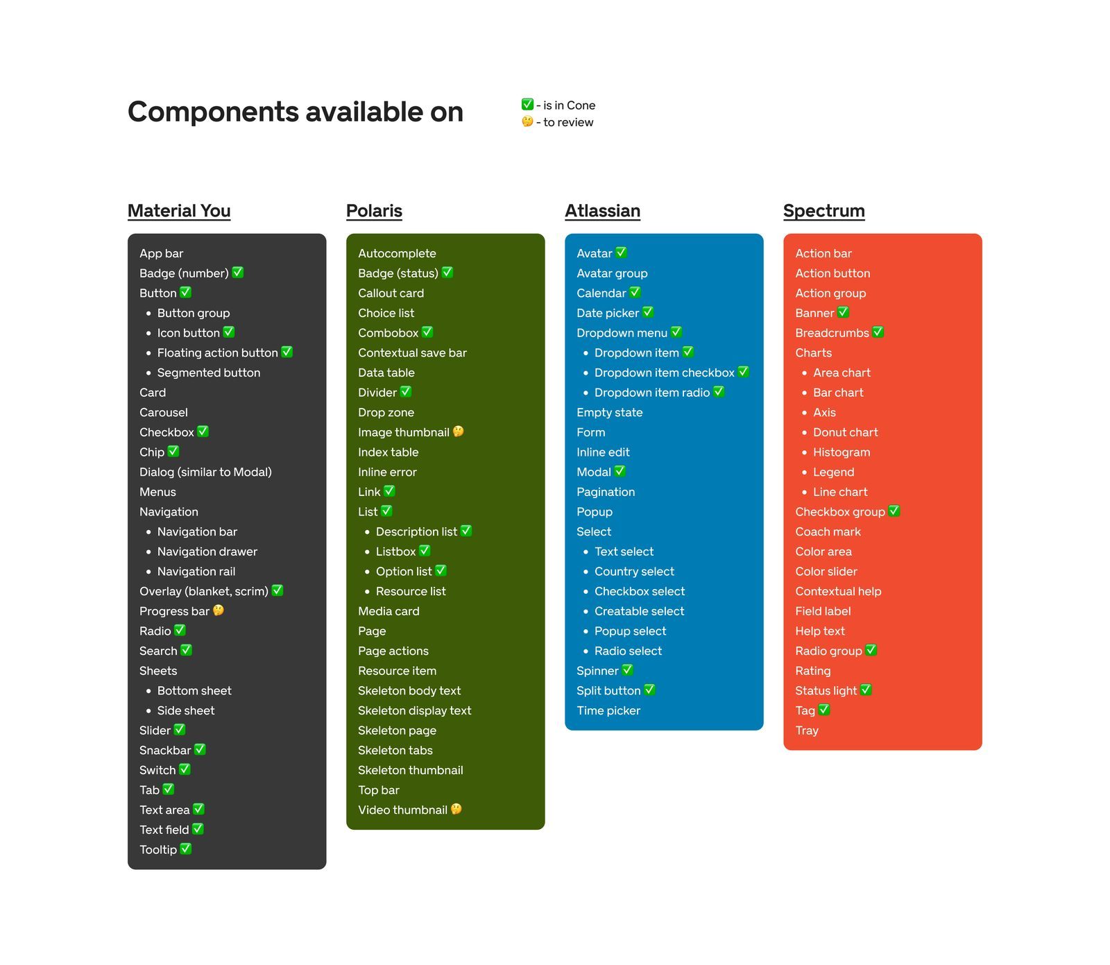
Before opening Figma, I took apart the systems of Google, Atlassian, IBM, Adobe and Shopify. Onfido’s token hierarchy became the model for ours. With front end, we picked shadcn as the component base, so developers started from a proven foundation instead of a blank file.
Key decisions
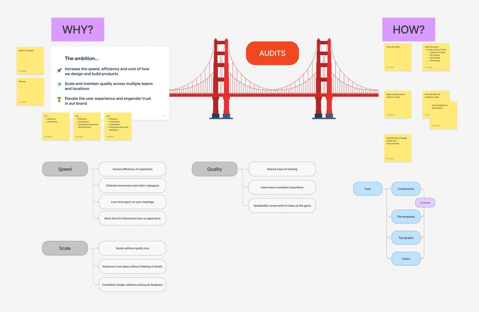
Five decisions that made one system work across three platforms.
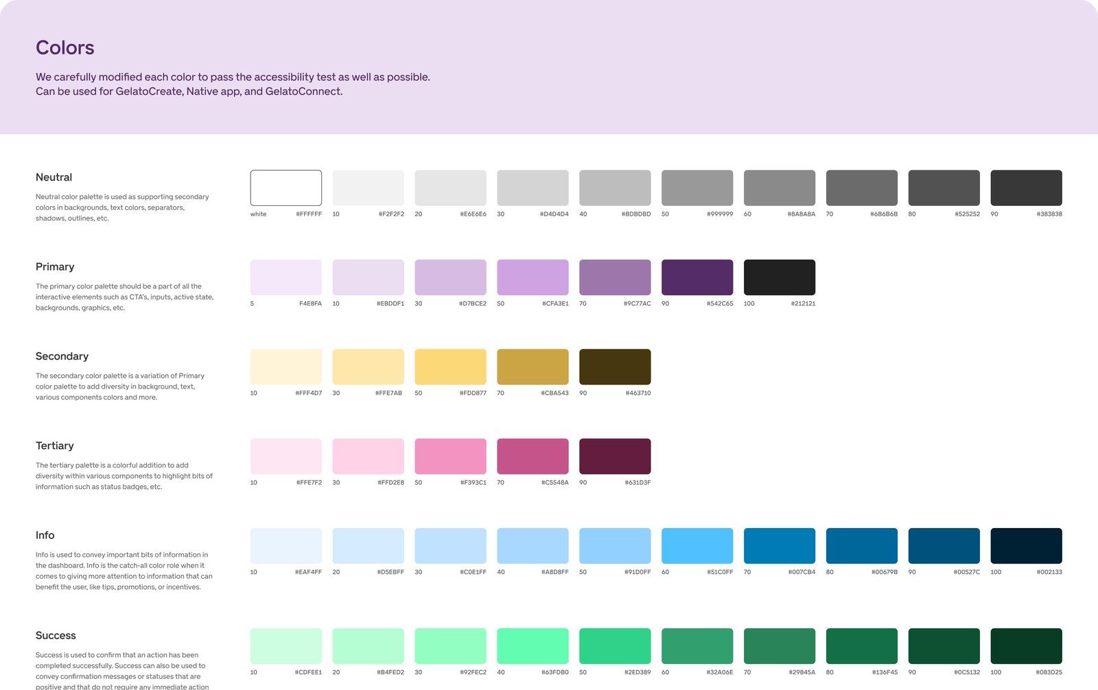
3.1 Tokens in Figma and in code from day one
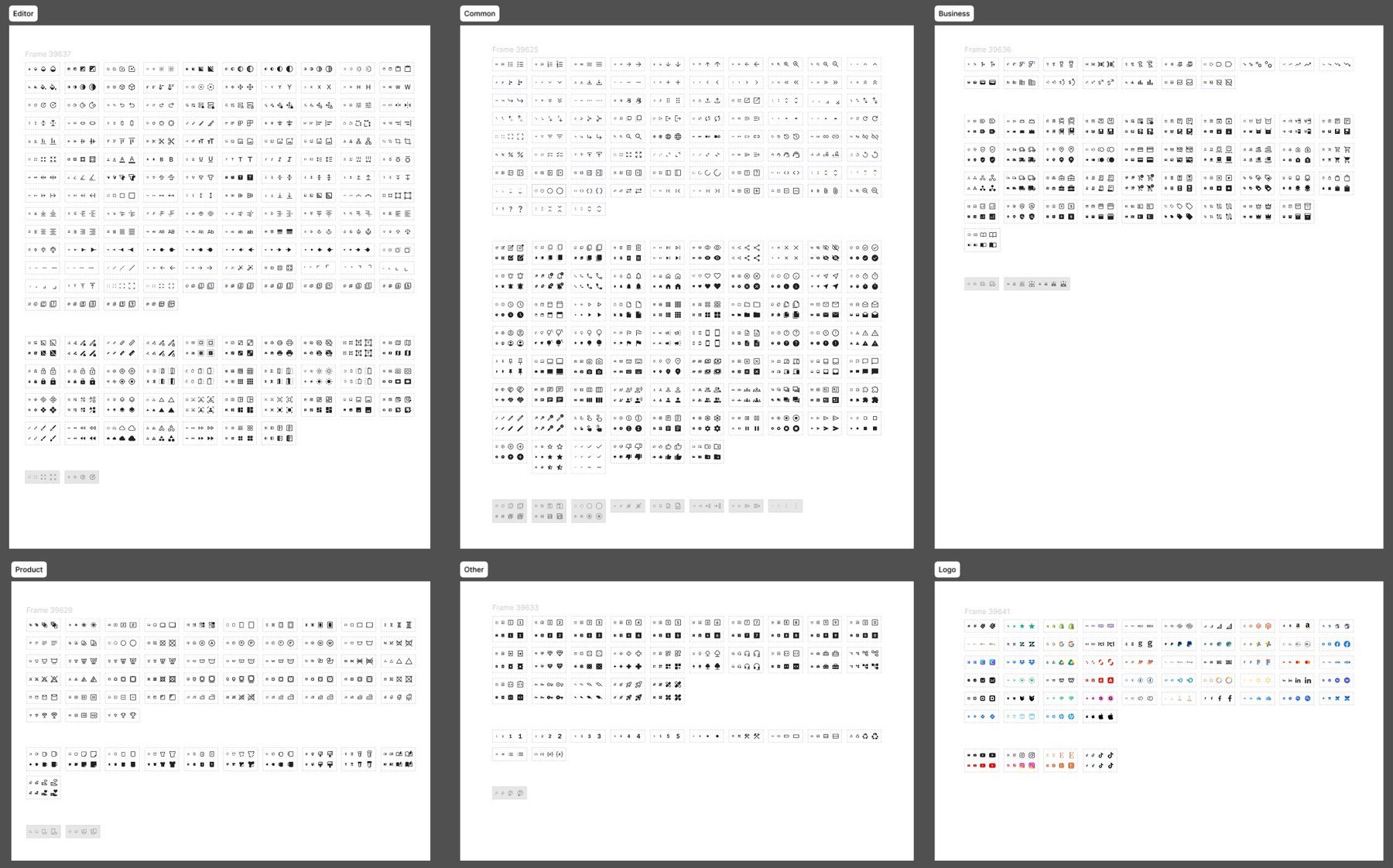
Colour, spacing and type live as variables, synced with code from the first release. Designers and developers use the same names, so handoff stops being a translation job.
3.2 shadcn’s behaviour, The Cone’s look
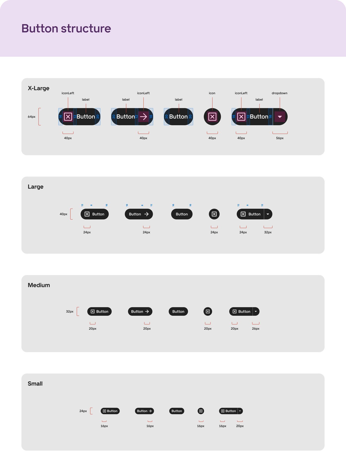
Front end took shadcn’s component logic as it is, and we put The Cone’s visual layer on top. Engineers kept a tested base, designers kept control of the look, and neither team rebuilt the other’s work.
3.3 One grid and one type scale for web and mobile
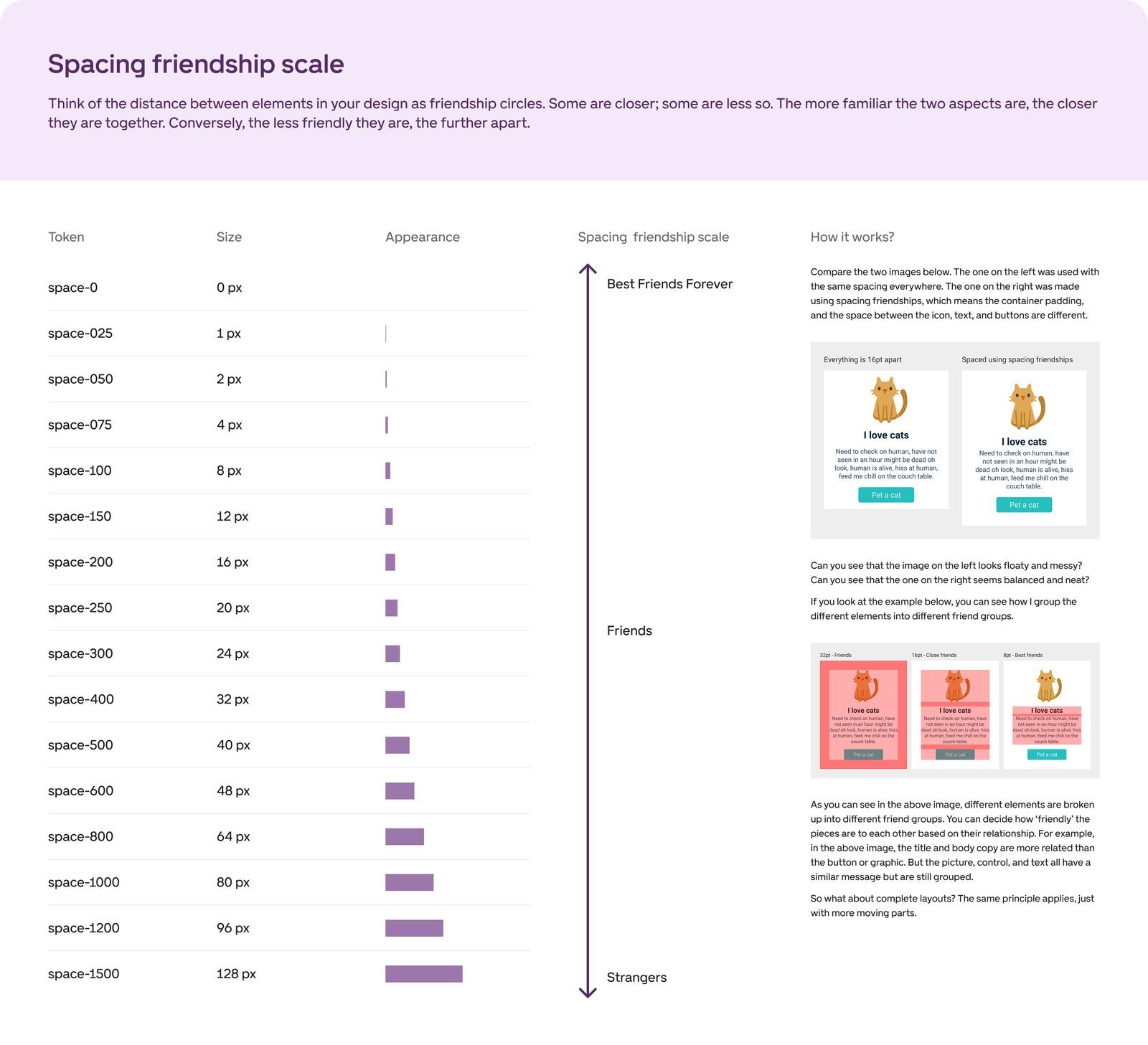
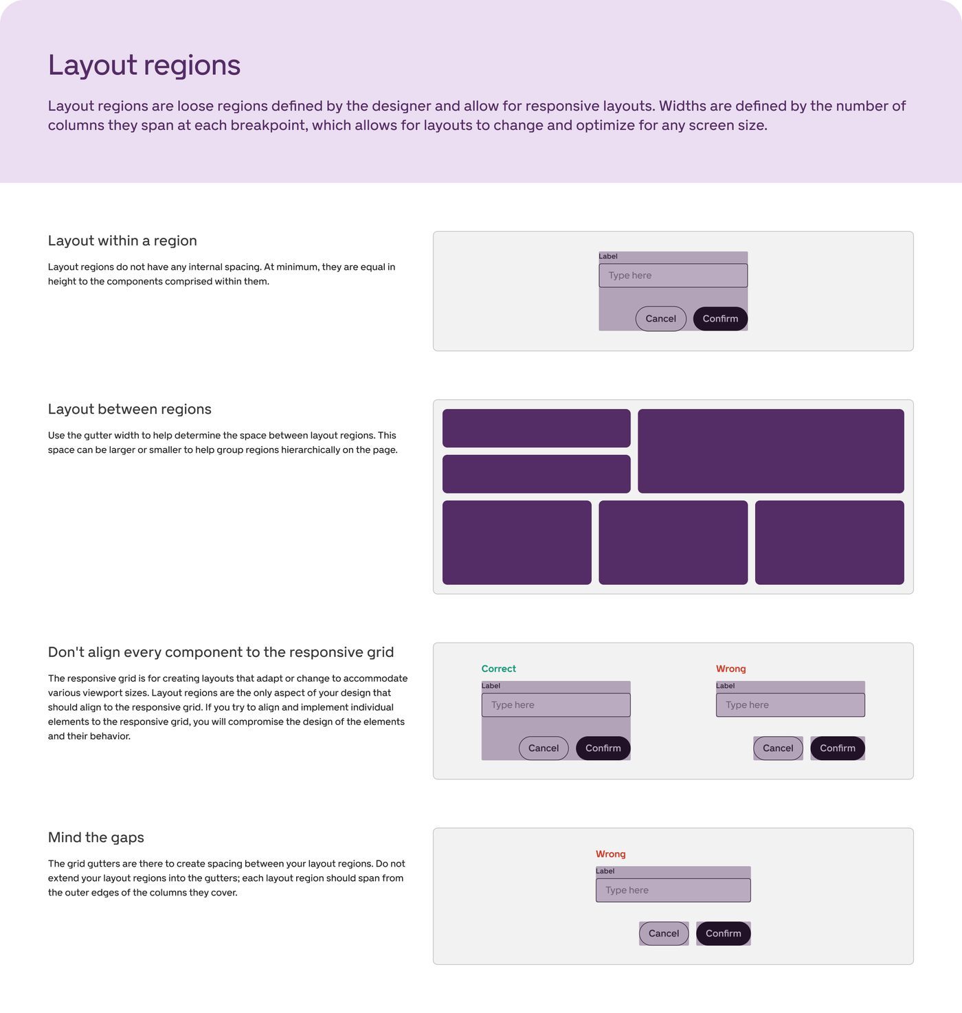
Shared breakpoints, layout regions and a type scale built on a 4px grid. Someone moving from GelatoConnect on a laptop to the app on a phone is still in the same product.
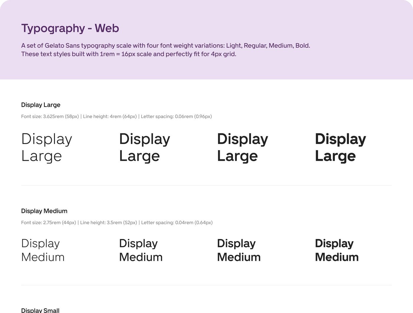
3.4 Documentation so teams decide without me
I brought in a colleague to write the docs with me: anatomy, usage, microcopy, how to add an icon. Teams found answers on their own instead of queueing for the one person who knew.
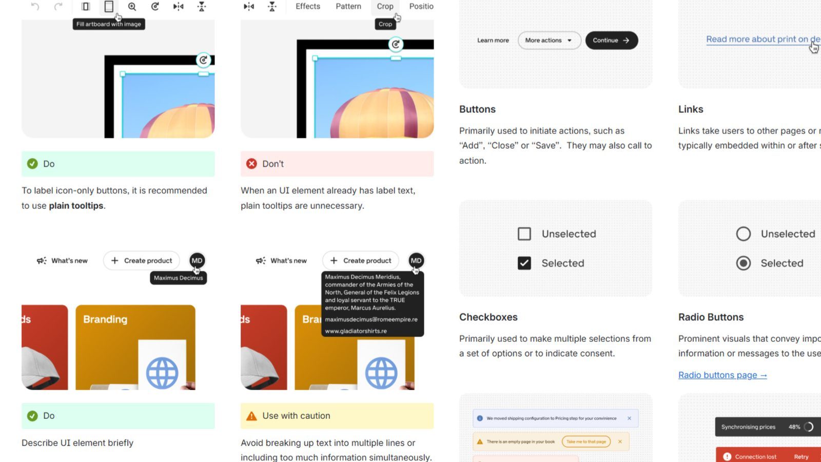
3.5 A rebrand that didn’t touch the architecture
B2B got a restrained, premium style that didn’t depend on the new identity. B2C changed with the rebrand, and the same structure carried both.
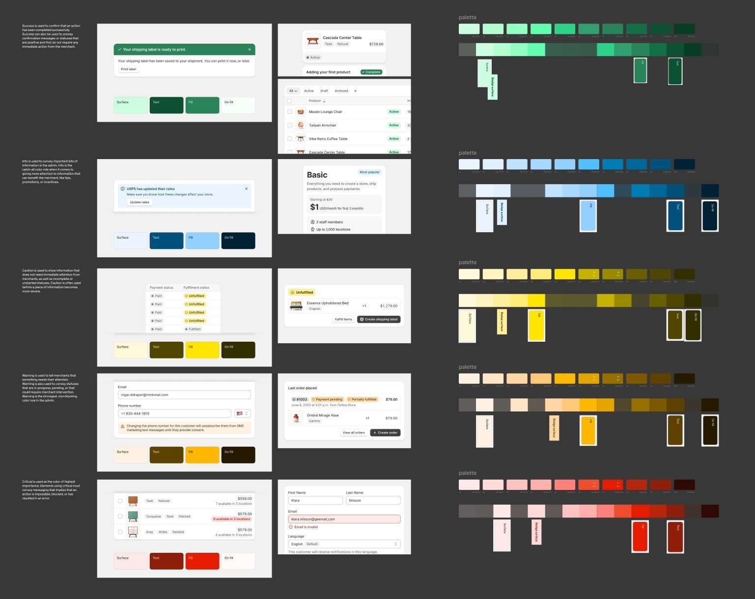
Why · Keeping B2B restrained was a deliberate call: partners run their business on it every day, and a premium, composed look served them better than following every brand move.
Adoption
Designers kept detaching components and not saying so. Reviews fixed that, not rules.
The real resistance was silos. Designers used their own components, or broke ours for one-off changes. I ran review sessions and workshops to pull everyone into one direction. To sceptical teams I pitched the system as less cognitive load for users, not visual consistency, and backed it with ready page templates. Before releases, design system compliance reviews caught what slipped through.
Results
Web and mobile finally feel like one product, built from the same parts.
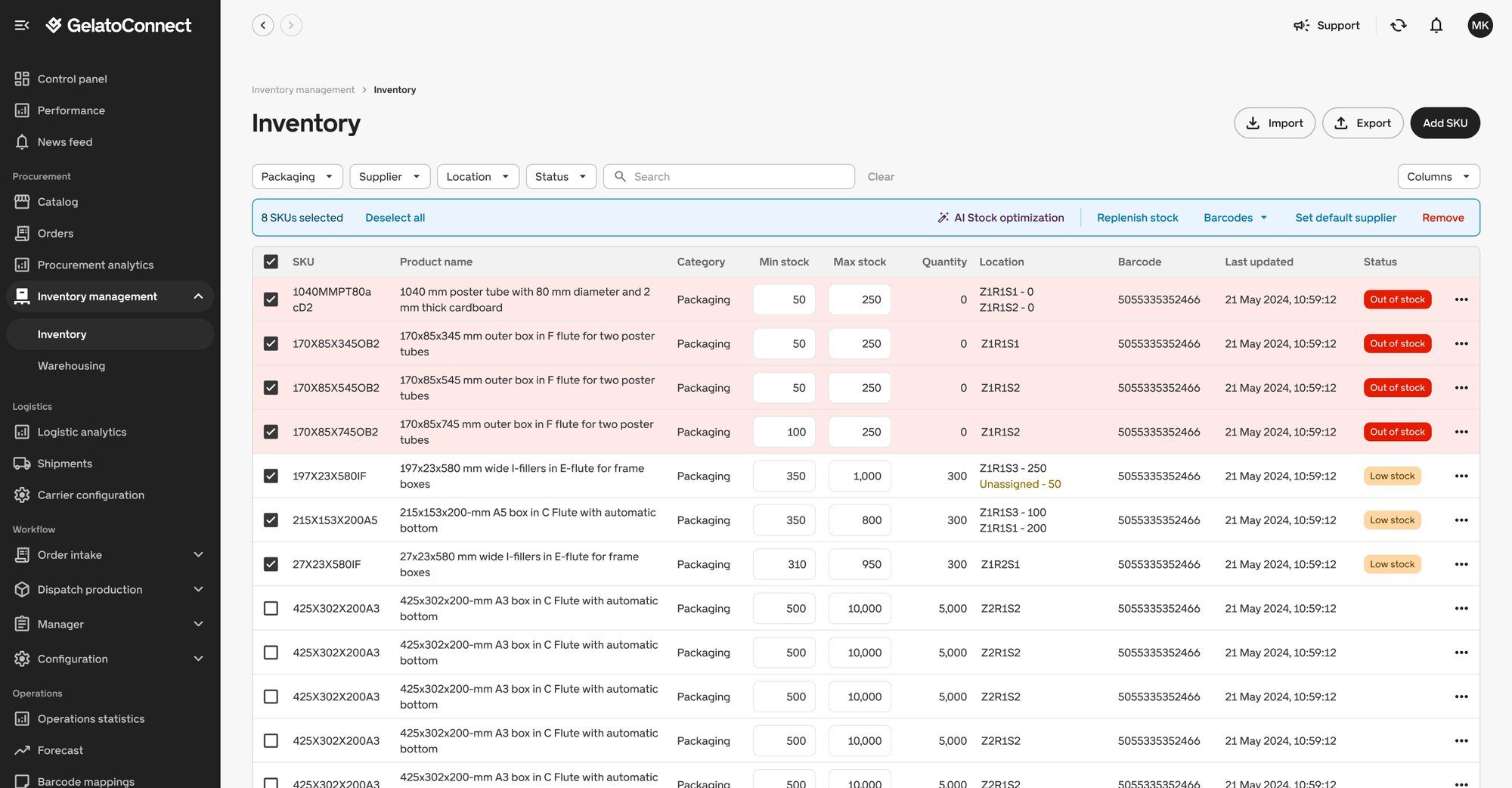 B2B · GelatoConnect, inventory
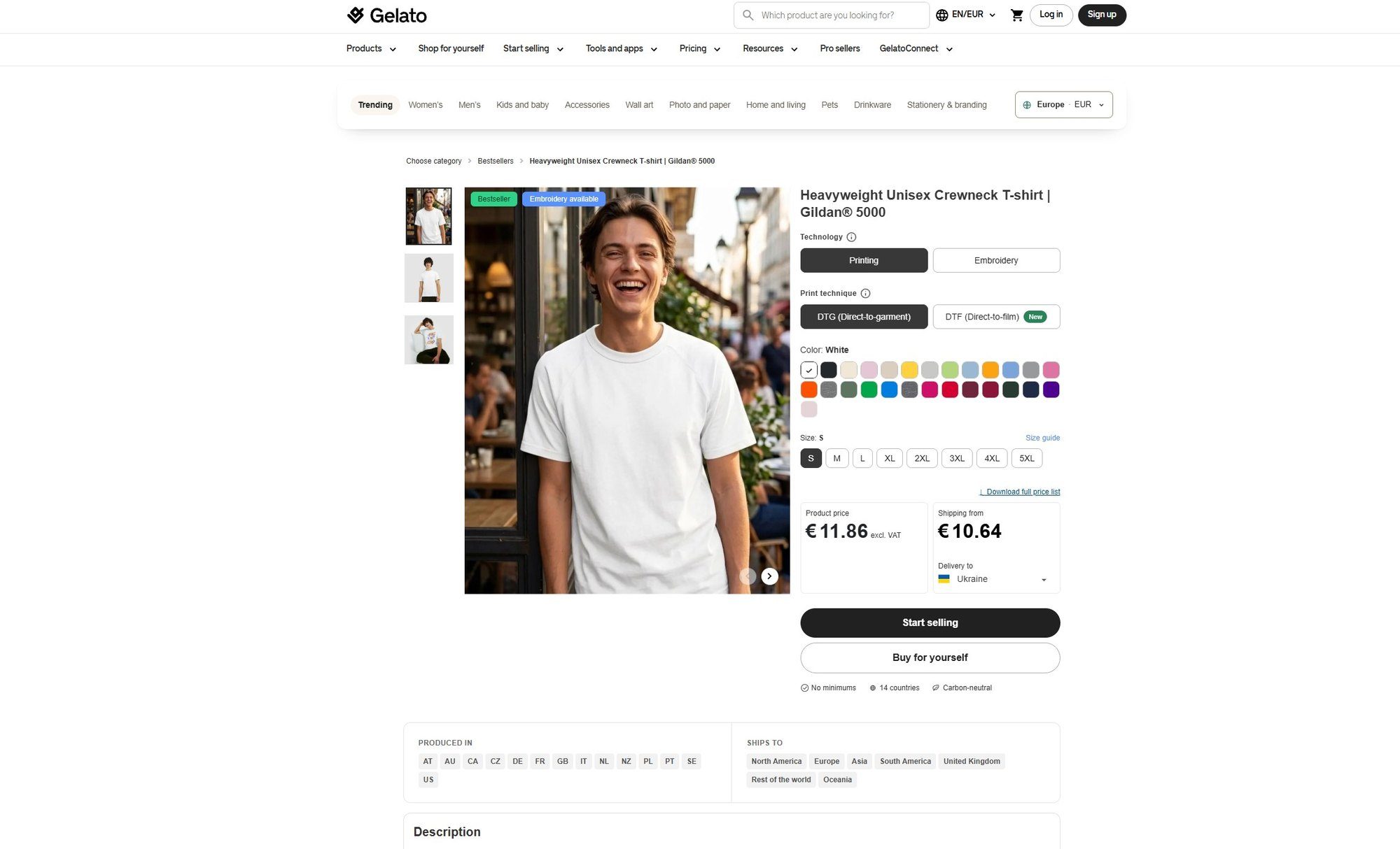 B2C · Gelato, product page
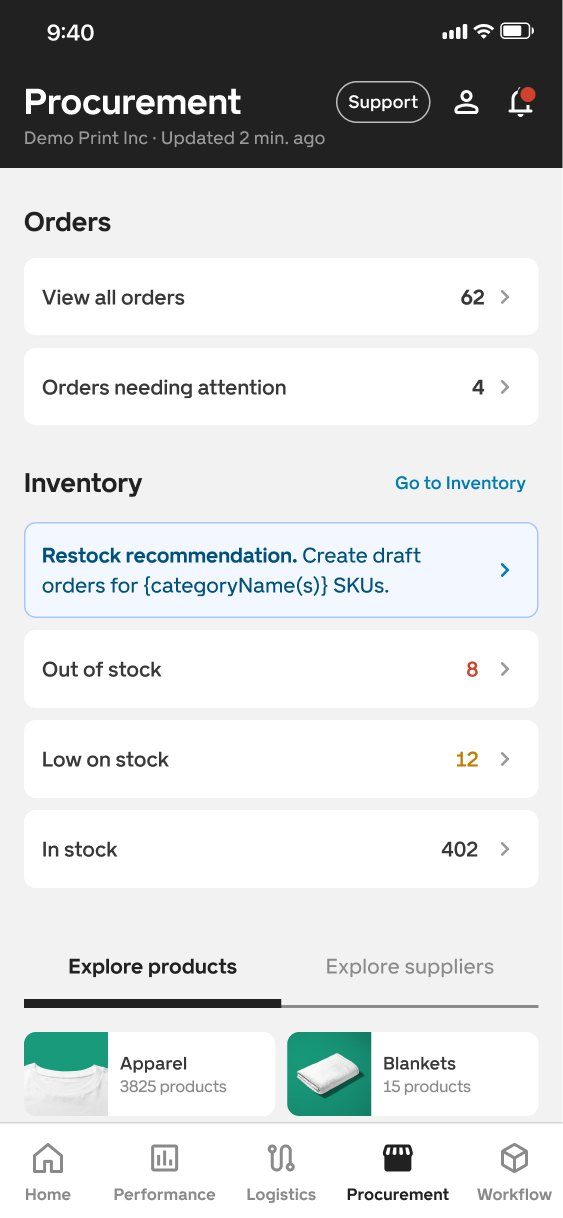
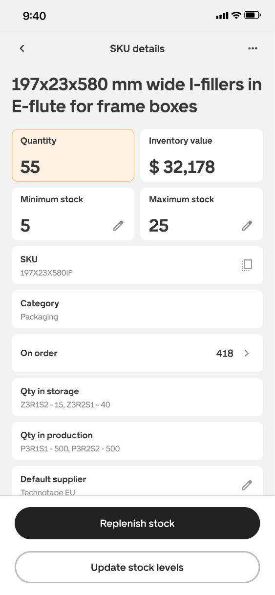
Law of Similarity. Elements that look alike are seen as related. When web and mobile share type, spacing and components, people read them as one product. lawsofux.com
- Faster handoff: less time documenting, more time designing
- More consistent pages, and fewer outdated ones left behind
- Design and front end share one view of where the product is going
- By the end, the Head of Design was building pages from the system with Cursor and teaching the team to do the same
What I took from it
A design system is a product too. Its users are the designers and engineers who build with it.
I learned token architecture, how to systematise and trim components as the system grows, how to hand a system this size to front end, and how to run workshops that turn critique into decisions.
“He researched options that fit our tech stack and team size, then shaped the structure and processes that allowed us to design and ship faster.”