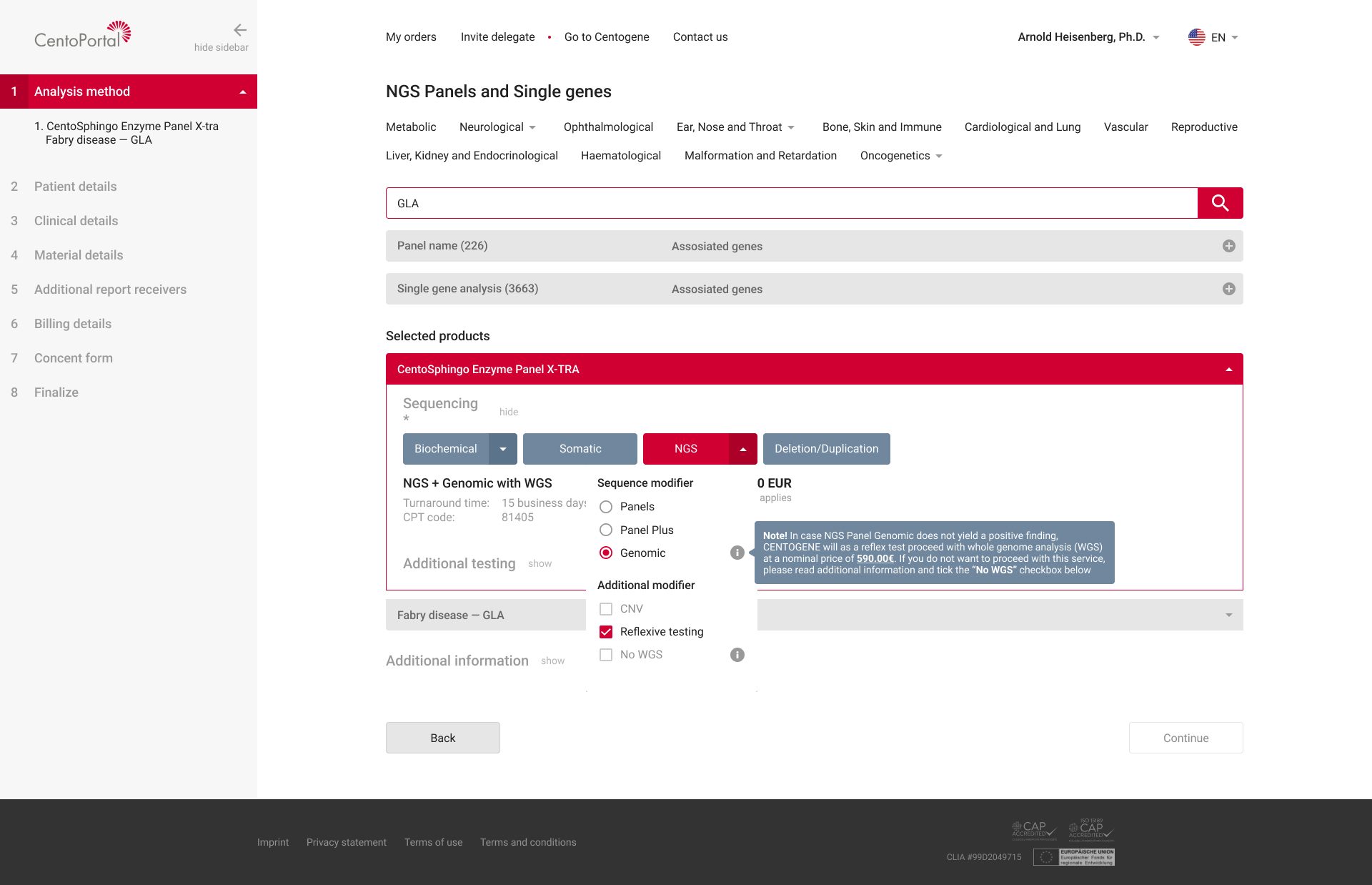
The problem
One order meant choosing from hundreds of tests, then filling in patient, clinical and billing data, in a single long flow.
Physicians and researchers use CentoPortal to order genetic tests and send a patient’s sample to the lab. The interface didn’t guide them: they had to find the right path on their own. Every wrong or incomplete order meant delays and rework for the lab, and a worse experience for the physician.
The approach
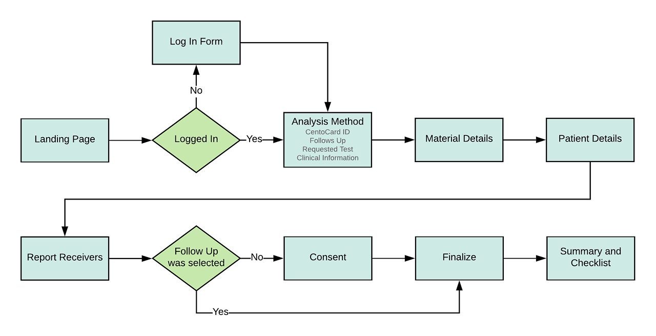
Don’t ask for everything at once. Let the test type decide what comes next.
The test someone picks defines which patient and clinical fields are needed. So the order became a guided sequence: each answer narrows the following steps, and the dependency between steps works the same way for every product. The goal wasn’t fewer steps. It was steps where the wrong option is much harder to pick.
Chunking. Breaking information into small, meaningful groups makes it easier to process. One form with every field became eight focused steps. lawsofux.com
Key decisions
Four decisions that made a complex order predictable.
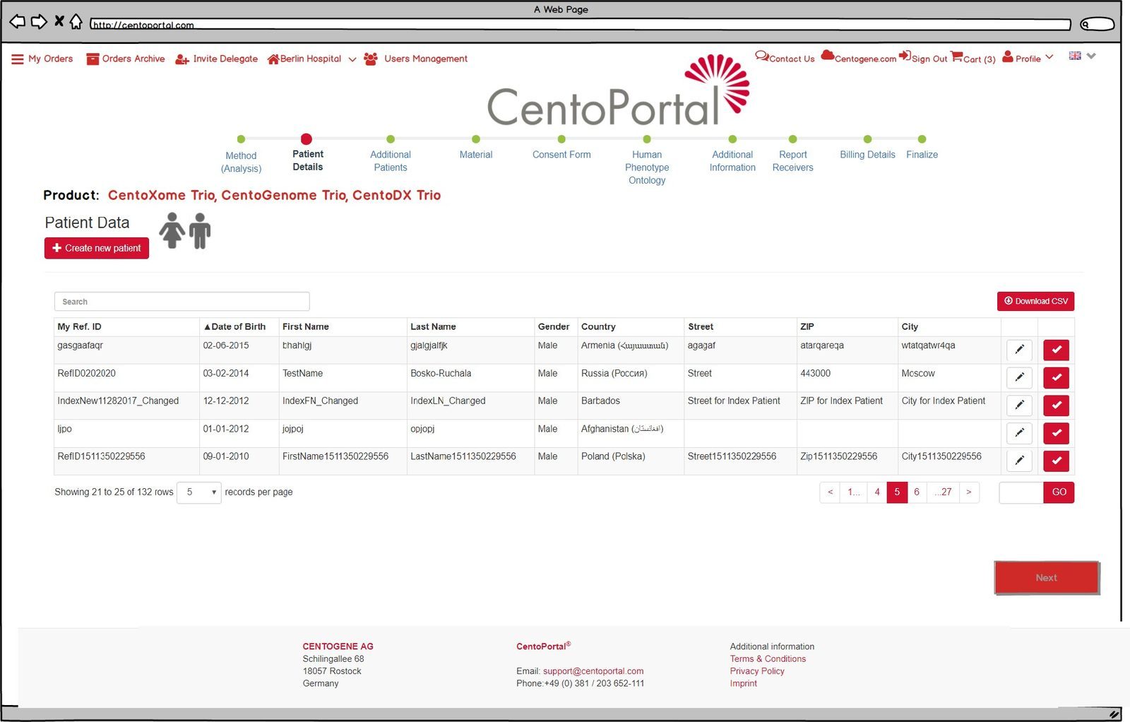
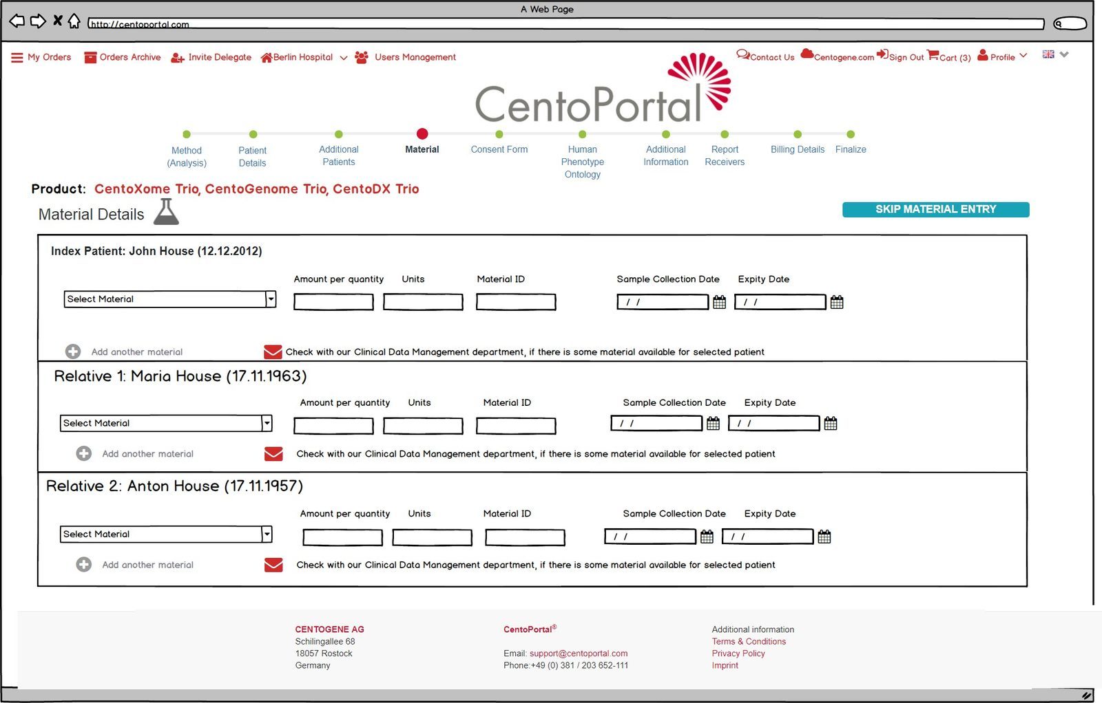
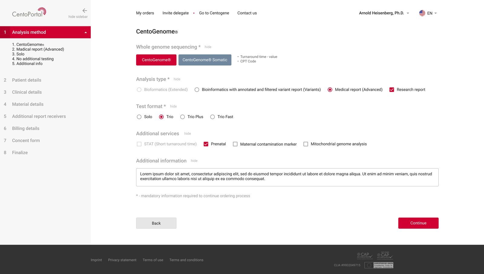
3.1 A guided order, one step at a time
Eight steps in a sidebar that always shows where you are, what’s done and what’s left. Finished steps stay editable, so going back never means starting over.
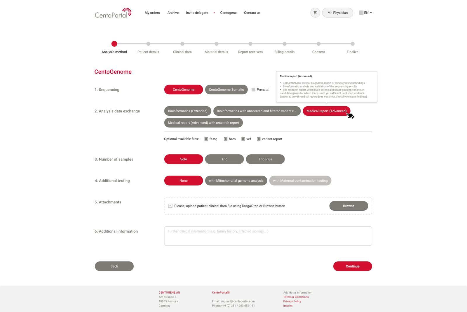
3.2 Incompatible combinations can’t be chosen
Instead of flagging a wrong combination as an error after the fact, options that don’t fit the chosen test are simply unavailable. A short note explains what each analysis includes, right where the choice is made.
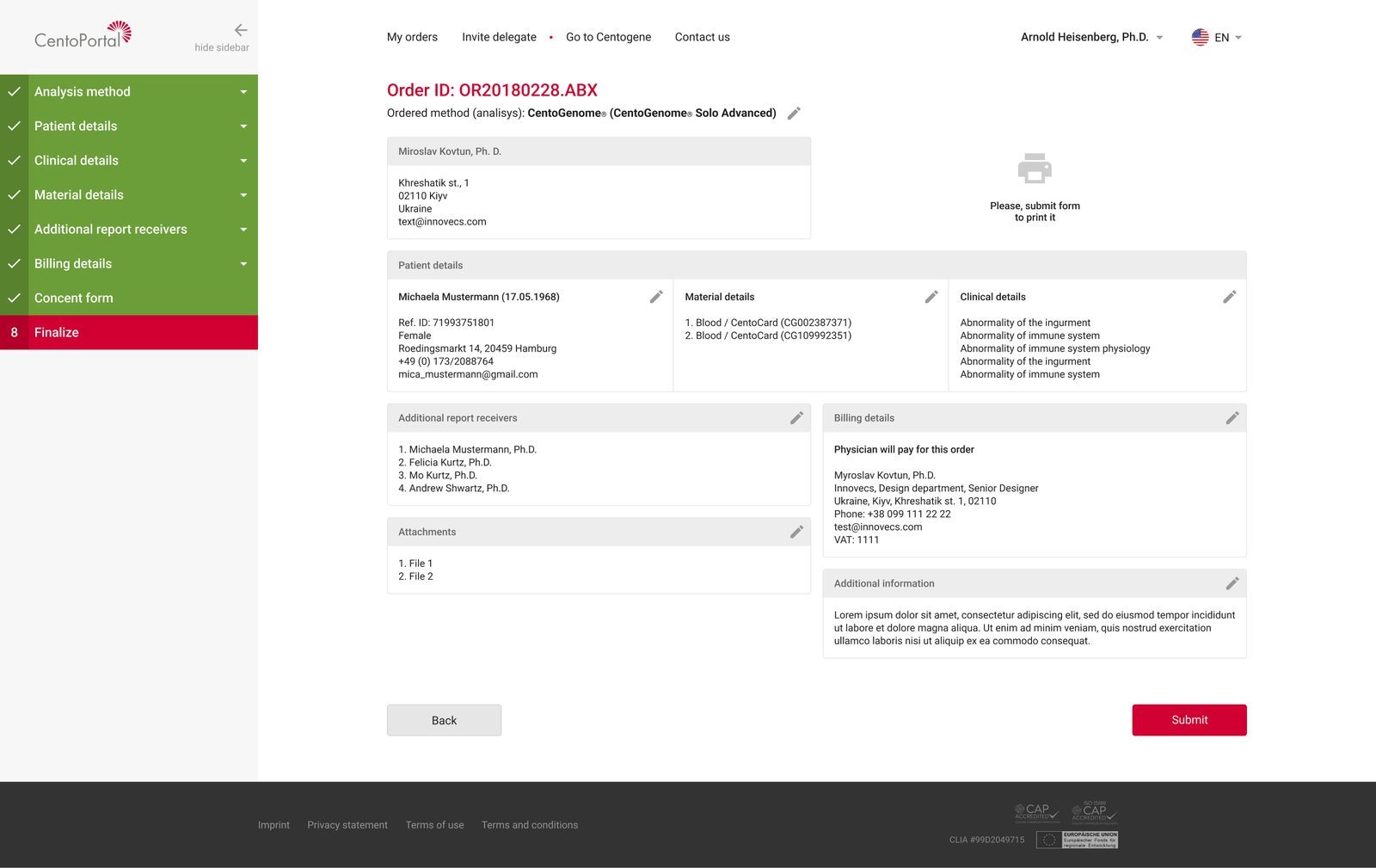
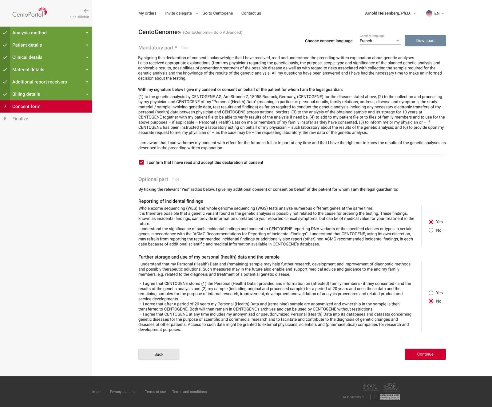
3.3 Two final checks before the sample leaves
A full order summary, where every block can be edited in place, and the legally required consent form. In medicine, a wrong order has clinical consequences, so the last screen is where mistakes get caught.
3.4 Physicians delegate the paperwork and keep control
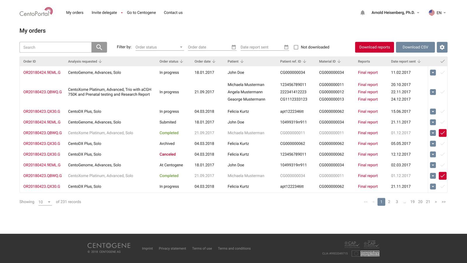
A page to track every order, invite delegates, and switch between accounts and institutions without logging in again. Physicians could hand the paperwork to their staff and keep control.
Constraints
A legacy codebase that couldn’t be rebuilt. I designed within its limits and was open about every compromise.
The old software was hard to change and a full rebuild was off the table, so the design had architectural limits. I checked feasibility with the engineers before each proposal. Where the legacy code didn’t allow the ideal solution, I explained the compromise to the client honestly, and argued for the approach on the screens with the most nested lists and controls. Deadlines were tight, and the client reviewed each step in detail.
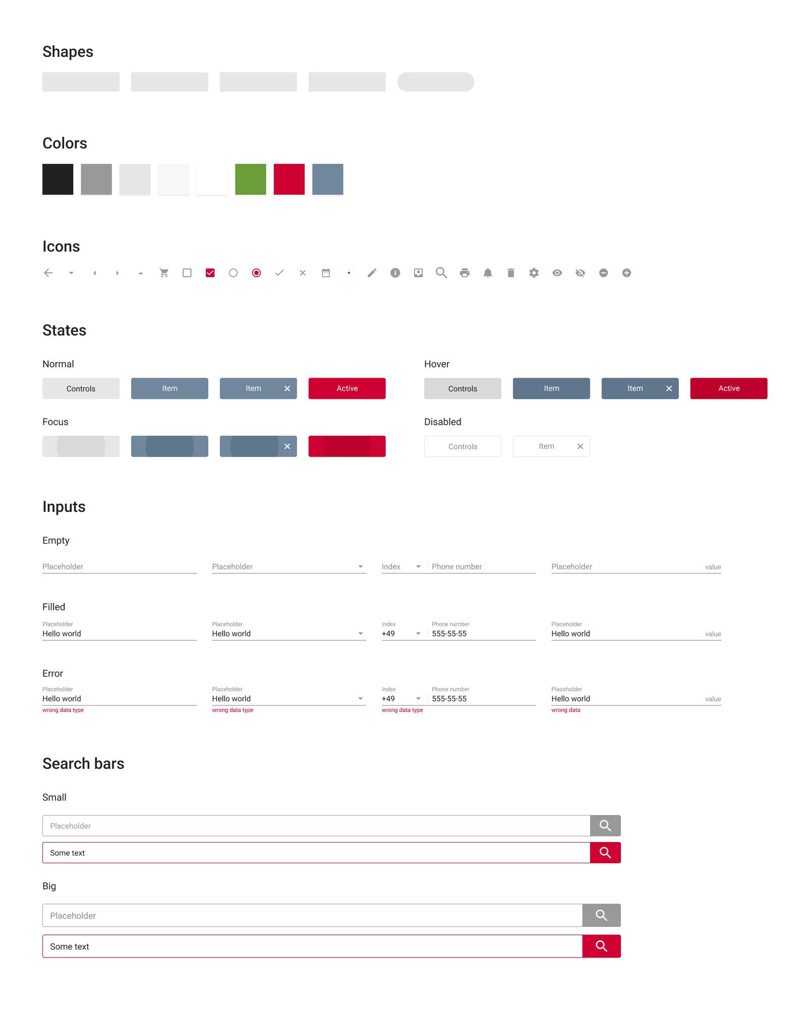
Trade-off · The design had to fit the existing architecture. A cleaner structure was possible on paper, but it wouldn’t have shipped on this codebase within these deadlines.
Results
A predictable path for physicians, and fewer ways to send the lab a wrong order.
No post-release data was shared, so the outcomes here are structural
- Safer
- Error prevention built into the flow itself, in a field where mistakes have clinical consequences.
- Predictable
- A step-by-step order path for physicians and researchers, the same for every product.
- Shared
- Delegates and account switching let staff manage orders on a physician’s behalf.
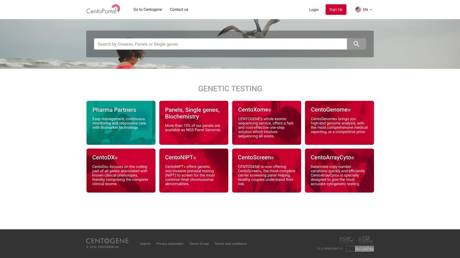
The client stayed actively involved until the end of the project, and the relationship stayed strong.
What I took from it
My first international client taught me that good collaboration starts with respecting how the other side works.
Presenting concepts in person during client visits, and answering detailed reviews step by step, I learned to explain design decisions in the client’s terms and to be honest about what the legacy system could and couldn’t do.
“He tends to use the best practices for the projects, understands how the interface decisions affect the whole product and can make it visually pleasing.”