The problem
HR managers needed detailed data and approvals. Employees needed a fraction of it. Both got the same outdated screens.
The app covers payslips, attendance, vacation requests and approvals for organisations in Israel. The UI was dated, hard to read and inconsistent, and features were missing. For the client, confusing screens were a real risk: HR and payroll data is sensitive, and mistakes have consequences. New features also had to land while the existing ones were being restructured, without making the app harder to use.
The audit
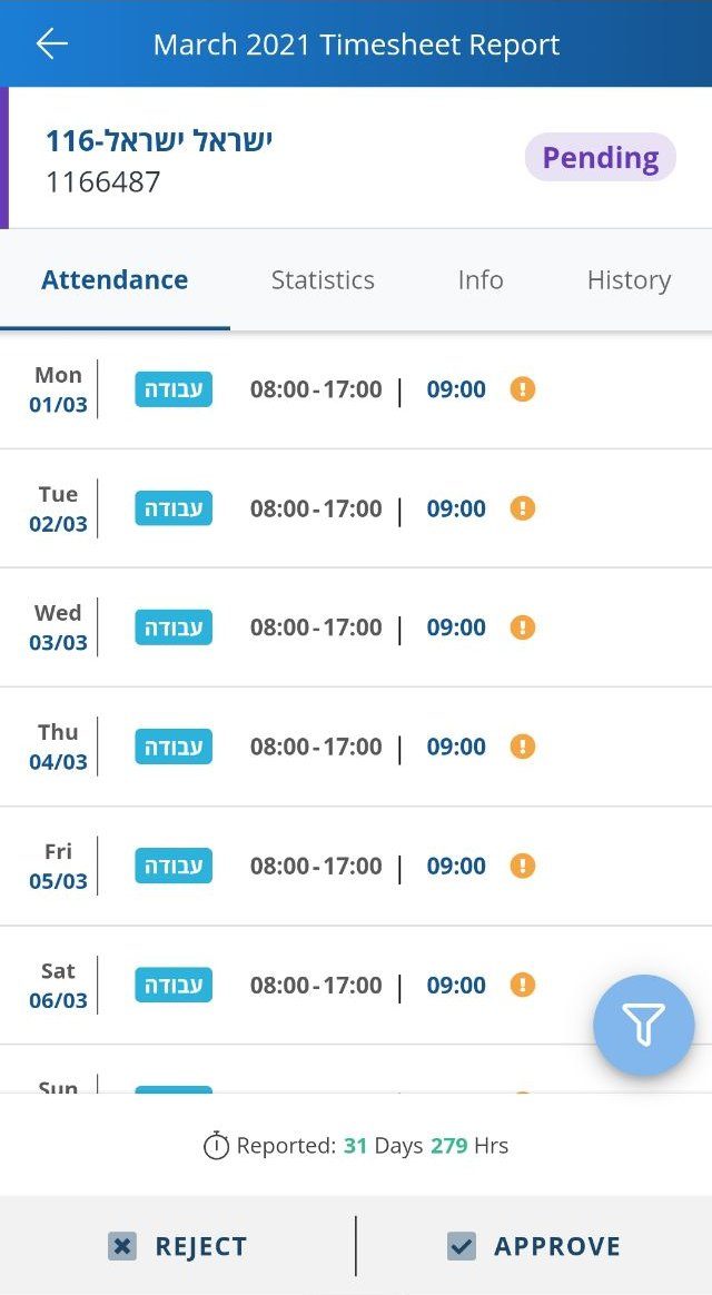
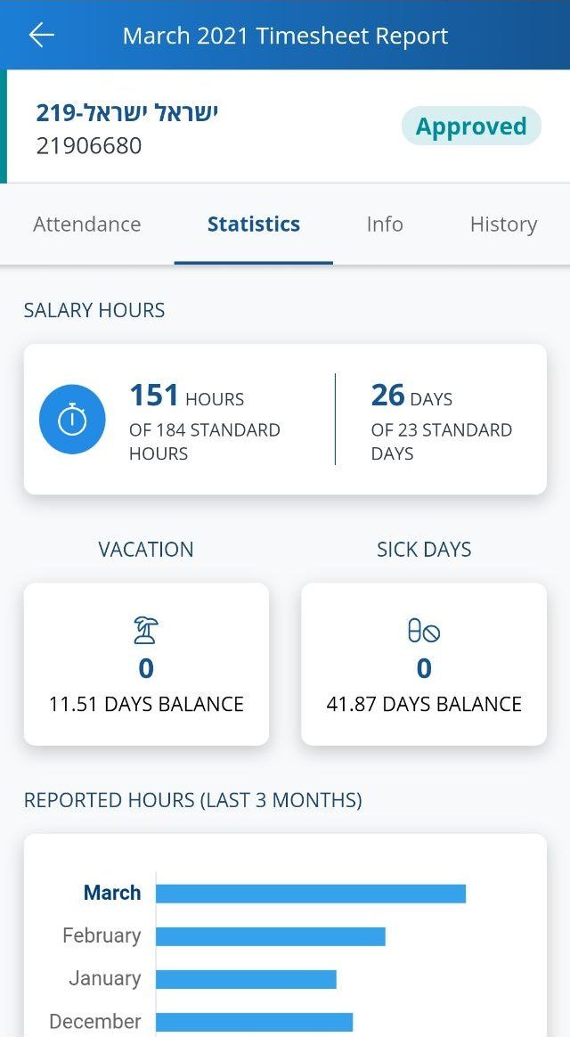
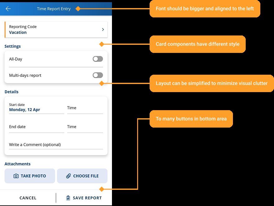
First the flows the client flagged, then the whole app end to end.
I mapped the problem flows the client pointed to, then audited the full experience. My findings and the client’s own notes went into one review, so we agreed on priorities before any design started.
Key decisions
Four decisions that made one app work for two very different jobs.
3.1 Two roles, clearly separated
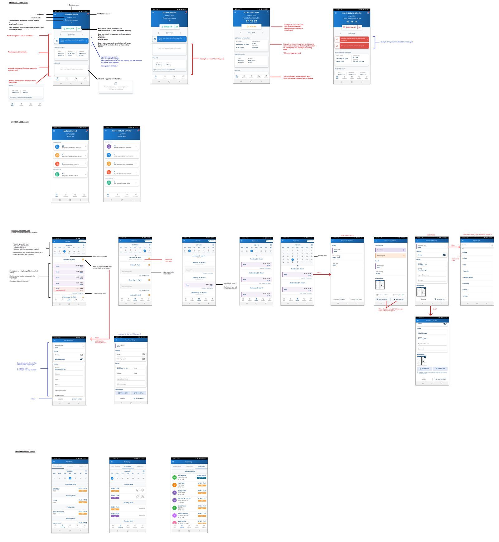
Deeper tools for HR managers, simple self-service for employees. A manager who is also an employee switches roles with one button at the top of the menu, instead of hunting for the right screens.
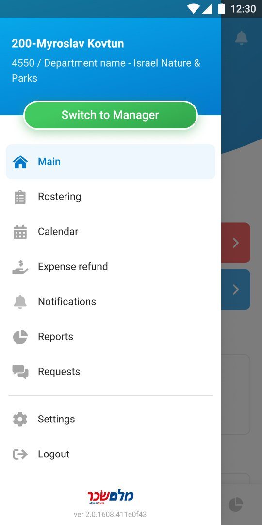
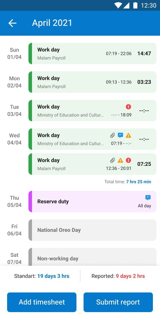
Employee. Only what an employee needs: their time, their requests, their reports, with one button to switch to the manager role.
3.2 The daily action is the biggest thing on screen
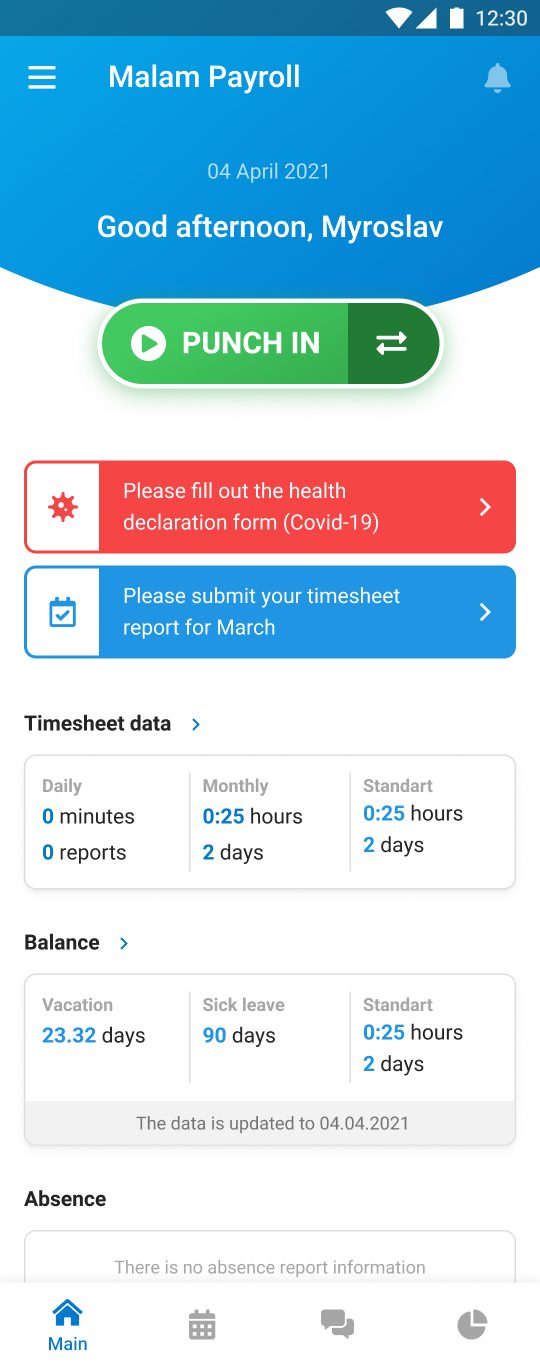
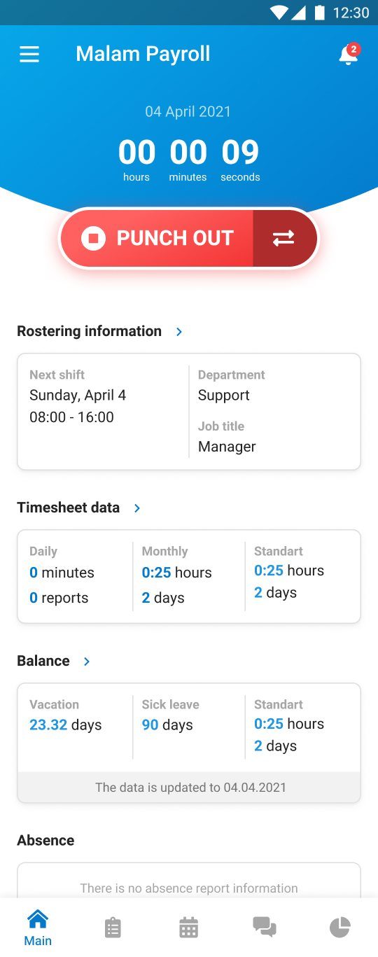
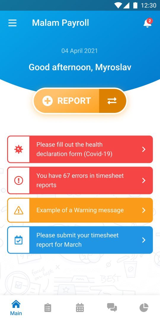
Punch in, punch out and report are one large button on the home screen. Below it, the things that need attention: a health declaration, timesheet errors, a report to submit.
Fitts’s Law. The time to reach a target depends on its size and distance. The action employees take every day, punching in and out, became the biggest target on the screen, right under the thumb. lawsofux.com
3.3 A small design library in Malam’s brand
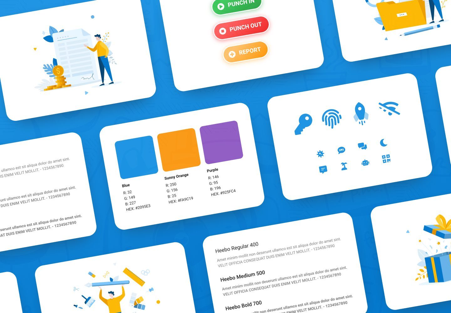
I proposed and built a light design library: Malam’s colours and illustrations, native mobile patterns, and a client font that supports both English and Hebrew. Every screen was designed twice, once for each language and direction. I convinced the client with examples from their own product that inconsistency was costing them trust.
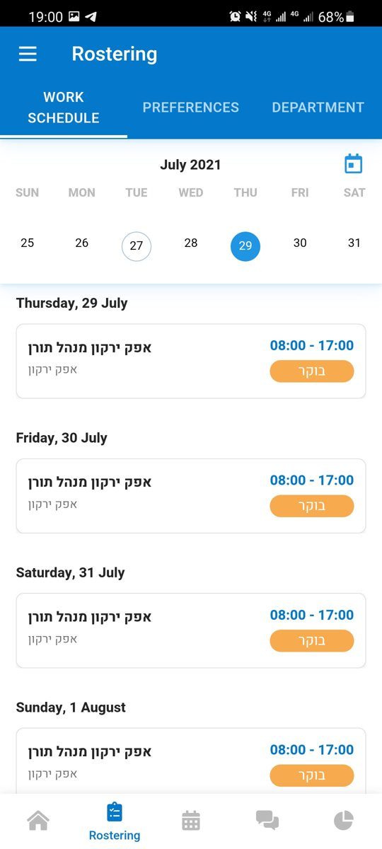
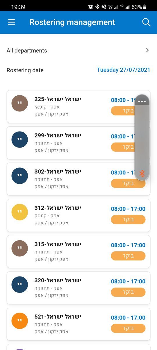
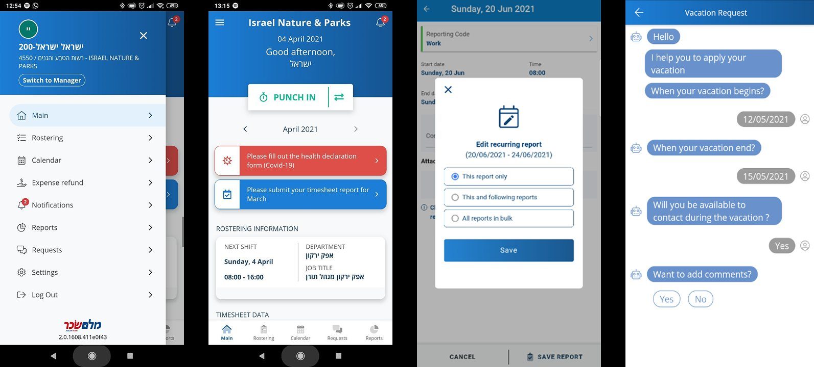
From the real app during the redesign, on a test account. Hebrew names, departments and shift types run right to left inside the same cards, while times and controls keep their place.
3.4 Paper processes moved into flows people already knew
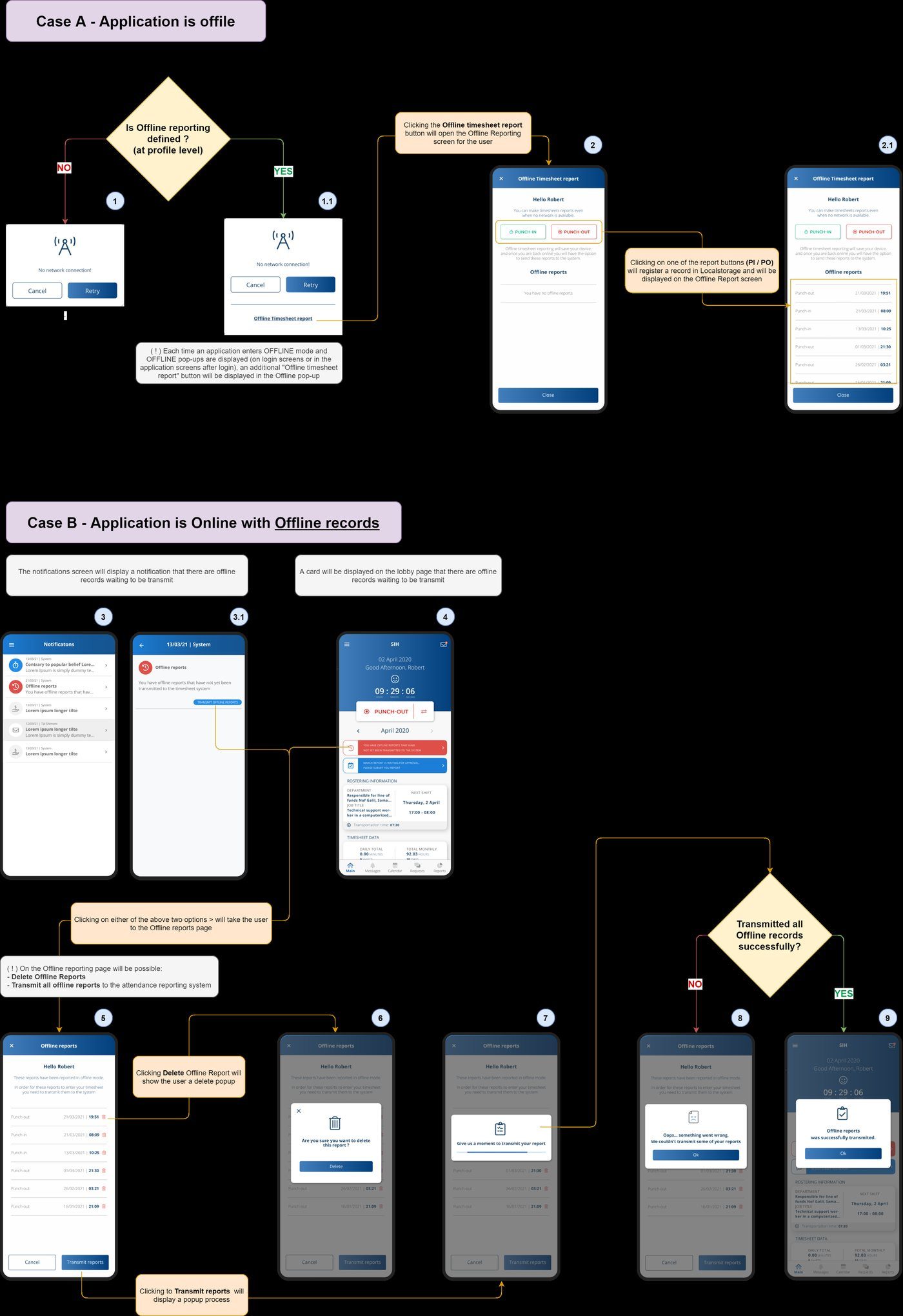
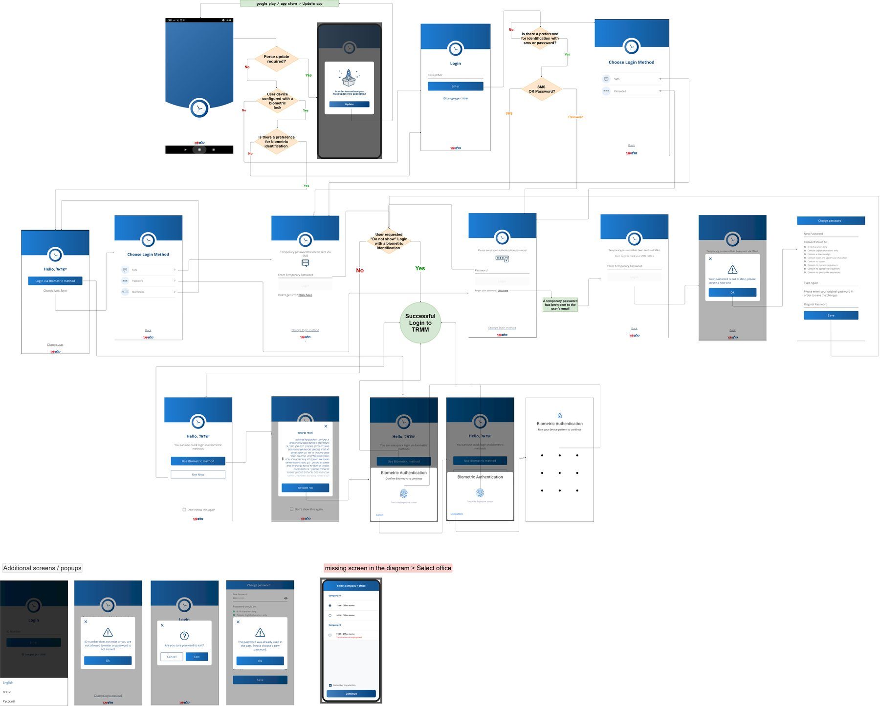
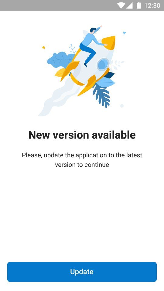
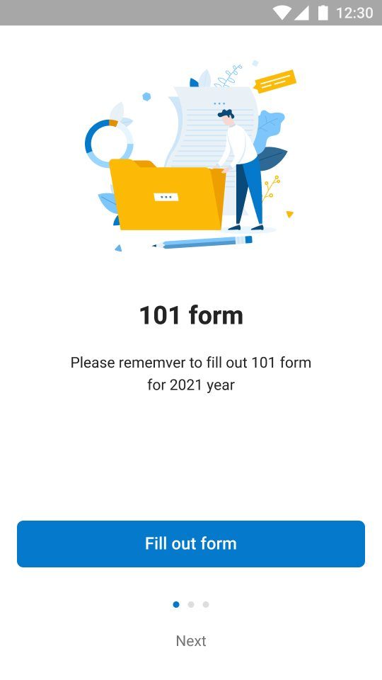
Vacation requests, payroll views and time tracking used to mean paper and manual data entry. They moved into the app inside workflows people already knew. Edge cases got their own flows: reporting offline, signing in, a required update or a yearly form.
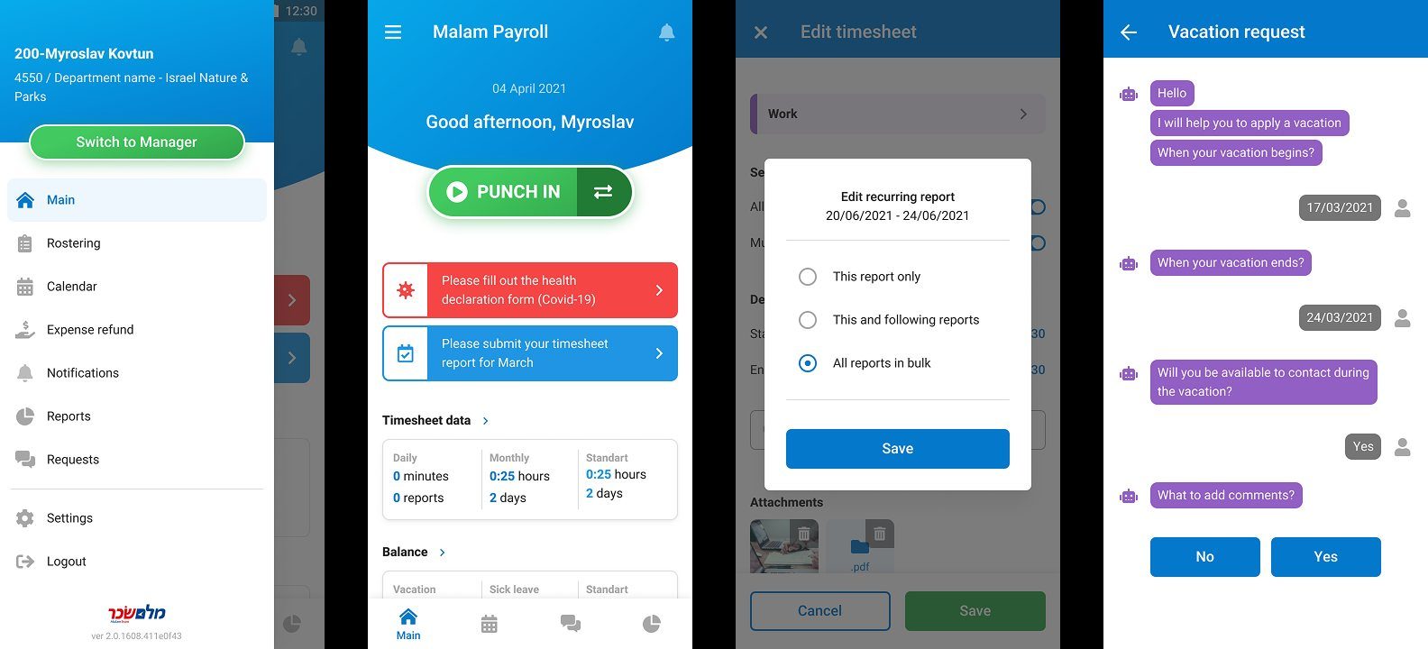
Before / after
Same data, same people. Clearer screens.
Results
Less paperwork, one consistent app, and a client who wanted to keep working together.
No post-release data was shared, so the outcomes here are structural
- Automated
- Vacation requests, payroll views and punch in / punch out replaced manual entry and paper reports.
- Consistent
- One visually consistent app for managers and employees, aligned with Malam’s brand.
What I took from it
Alone with the client, I learned to think like a manager: client and users first, design as the way to serve them.
This was one of the few projects where it was just me and the client. Prioritising their business and their users, rather than the design for its own sake, is what made the changes land, and kept the feedback loop tight until delivery. At the end the client wanted to keep working with me directly; the outsourcing contract didn’t allow it.